Red, orange, yellow, green, blue, indigo, violet – ROY G BIV. This popular acronym started as a way to identify a common color sequence, like that of a rainbow. And it’s the varying shades of these colors that change the way we see the world each day; from the moment we get dressed to the foods we eat. But with all the colors in the rainbow (and so many in between), why do we see mostly blue or white in healthcare? Are we simply conditioned to choose those colors or is there a purpose for using them in medical packaging? If all packaging is the same color, how does the end user differentiate between products on the shelf?
The Meaning of Blue and White in Healthcare
With all the possible color combinations, it might not surprise you that colors can elicit particular emotions or influence specific actions. In fact, there are countless studies that indicate how each color makes us feel. So it is not by accident that blue and white are often used in high-pressure environments like healthcare.
-1.png?quality=low)
The color blue symbolizes calmness and trust. And in some studies, the color blue has even been proven to lower both your heart rate and blood pressure. Where white generates a feeling of cleanliness and safety.
While blue and white provoke the feelings we certainly want in a healthcare environment, the decision to incorporate blue into healthcare isn’t just to make patients feel reassured. Rather, the color blue was purposely chosen because it is opposing red on the color spectrum. In an operating room, where blood is the color red, using blue surgical towels and draping can actually help make the red stand out more and can help physicians perform better!
The Color of Medical Packaging
Similarly, the color of medical packaging is also driven by the feeling it represents, but additionally the material it’s made from.
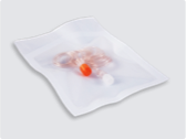
When you think about medical packaging as a whole, there are two important components to consider—the sterile barrier system and the shelf carton. Both are designed with patient safety as the number one priority.
For the sterile barrier system, having a white colored package evokes confidence in the end user and recipient that the product inside is clean and sterile. In fact, there have even been conversations in the industry that if packaging is clear or colored, the perception is that it’s not sterile (although we know that’s not necessarily true). When a color additive is used, like in PETG trays and some adhesive coatings, you’ll find it’s often blue for the same reasons – to symbolize trust in the packaging. By using white and blue as the color of packaging, it also avoids looking moldy or dirty, or being confused with yellowing packaging.
When it comes to the shelf carton, there is often a little more color added to help with labelling and product differentiation. However, outside of logo colors, be careful when using the color red as it is often seen as a sign of danger or an indicator that careful action should be taken. This is where working with your company’s Marketing team can help balance branding efforts with providing confidence of a safe product.
Using Color to Differentiate
With nearly every package on the shelf of a medical supply room visually appearing the same, for the end user to choose the correct item off the shelf, it often comes down to the color of the therapy itself.
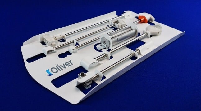
For high-end devices or therapies, specific colors are crucial to differentiate sizes or measurements, differentiate a brand, and meet compliance regulations. The coloring of the product can also help to provide a second visual, after the label, for the end user to select the proper device for the procedure. Throughout the complex thought process behind the design of a product, each decision is always made to maintain the highest level of patient safety.
Overall, there is a lot to consider when thinking about the implications of color in healthcare. But across the sea of blue and white, the end user can feel assured we are delivering safe and sterile products.